What Makes People Leave a Website in the First 10 Seconds?
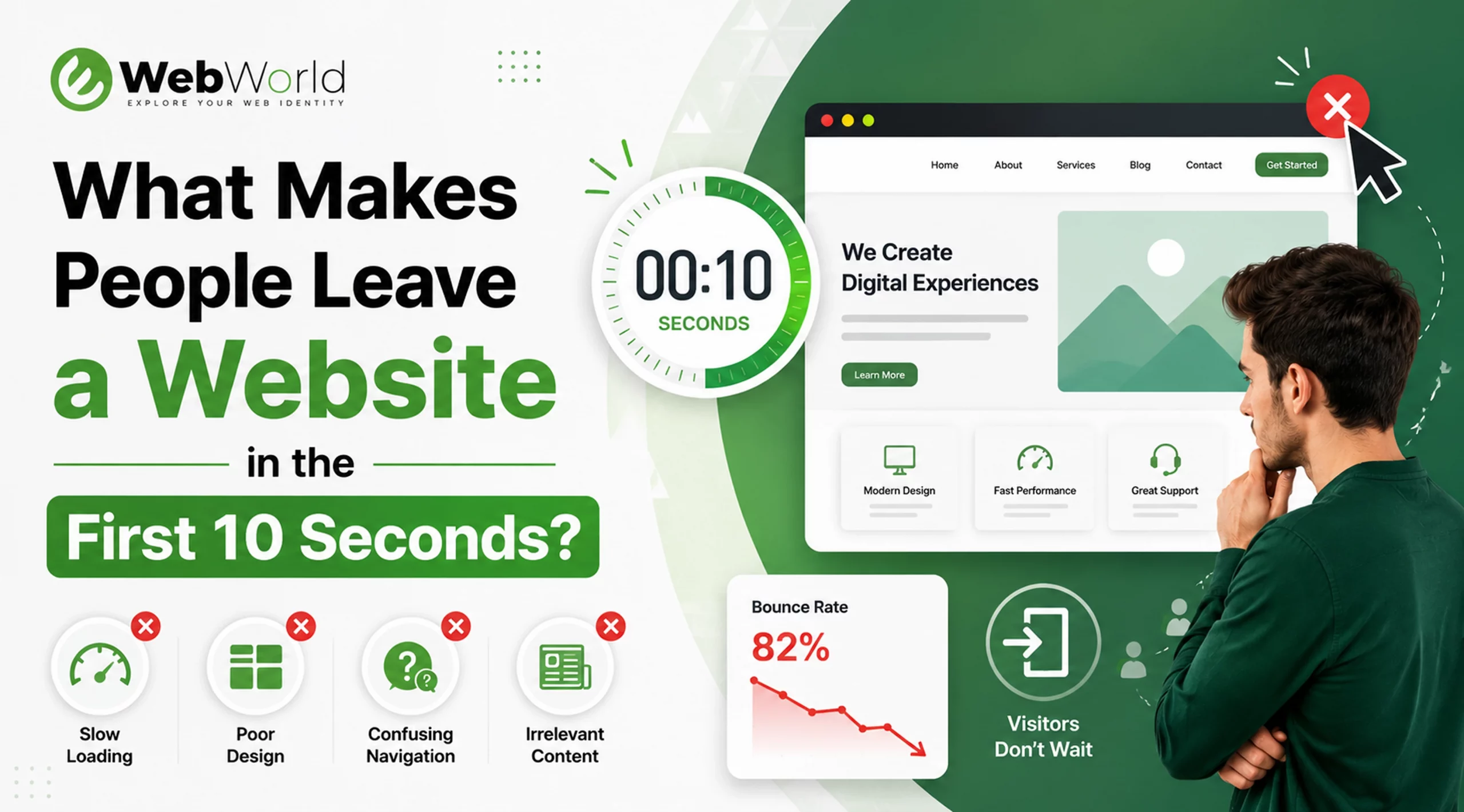
Your website doesn’t have minutes to impress visitors—it has seconds. Research shows users form an opinion about a website almost instantly, and many decide whether to stay or leave within the first 10 seconds.
If visitors leave before exploring your products or services, your website isn’t just losing traffic—it’s losing potential revenue.
Within seconds of landing on a website, users form an opinion about it. According to research and user behavior studies, visitors often decide whether to stay or leave in less than ten seconds. For businesses, those few seconds can mean the difference between turning a visitor into a customer and losing them forever.
If your website is attracting visitors but not generating inquiries, leads, or sales, the issue may not be your marketing efforts—it could be the first impression your website creates.
Today’s users have countless options at their fingertips. If a website feels slow, confusing, outdated, or untrustworthy, visitors are likely to leave within seconds and look elsewhere. Those lost visitors often become missed opportunities, lost leads, and potential customers who never return.
Let’s explore the most common reasons people leave a website within the first 10 seconds and what you can do to keep them engaged, build trust, and increase conversions.
1. Slow Loading Speed
Nothing drives visitors away faster than a slow-loading website. Today’s internet users expect websites to load almost instantly. If a page takes too long to appear, many visitors will leave before they even have a chance to view your content, products, or services.
Common causes of slow websites:
- Large, unoptimized images that take longer to load
- Poor-quality hosting that affects server response times
- Excessive plugins and third-party tools that increase page weight
- Heavy animations and unnecessary scripts that slow down rendering
- Lack of caching and performance optimization, resulting in repeated loading of resources
Why it matters:
Website speed plays a critical role in both user experience and search engine rankings. Even a few seconds of delay can increase bounce rates, reduce engagement, and lead to lost business opportunities. Visitors are far less likely to stay, explore, or convert when a website feels slow and unresponsive.
How to fix it:
- Compress and optimize images before uploading
- Choose a reliable and high-performance hosting provider
- Remove unnecessary plugins and third-party scripts
- Enable browser and server-side caching
- Minify and optimize website code, CSS, and JavaScript files
A fast website creates a strong first impression, improves user satisfaction, and encourages visitors to stay longer, explore more pages, and take action. You can regularly test your site’s performance using Google PageSpeed Insights to identify speed issues and implement recommended improvements.
2. Outdated or Unprofessional Design
First impressions matter, and your website’s design plays a major role in how visitors perceive your business.
People often judge a company’s credibility based on the appearance of its website. If your site looks outdated, cluttered, or unprofessional, visitors may quickly lose confidence in your brand and leave before exploring further.
Signs of outdated design:
- Old-fashioned layouts that don’t follow modern design standards
- Poor typography that makes content difficult to read
- Inconsistent colors and branding elements
- Low-quality or outdated images
- Too many distracting elements, pop-ups, or visual clutter
What users think:
Visitors frequently associate the quality of a website with the quality of the business behind it. A poorly maintained website can create doubts about professionalism, reliability, and attention to detail. As a result, potential customers may choose a competitor with a more polished online presence.
How to Improve It
- Refresh your website with a clean, modern layout
- Use consistent branding, colors, and typography
- Replace outdated visuals with high-quality images
- Simplify the design to improve usability and focus
- Ensure the website looks professional across all devices
3. No Clear Value Proposition
When visitors arrive on your website, they should immediately understand:
- Who you are
- What products or services you offer
- How you can help solve their problem
- Why they should choose your business over competitors
If users have to scroll, click through multiple pages, or search for basic information, there’s a good chance they’ll leave and look elsewhere.
Why It Matters
Visitors make quick decisions. Within seconds, they determine whether your website is relevant to their needs. If your message is unclear, they may become confused and lose interest before taking any action.
Example:
Weak Headline:
Welcome to Our Website
Strong Headline:
Professional Website Development Services That Help Businesses Generate More Leads
The second headline instantly communicates what the business offers and the value customers can expect.
How to Improve It
- Create a clear and compelling headline
- Highlight your main services or solutions immediately
- Focus on the benefits customers will receive
- Use simple, easy-to-understand language
- Include a strong call-to-action near the top of the page
Pro Tip
Place your key message “above the fold”—the section visitors see before scrolling. A clear value proposition can capture attention, build interest, and encourage users to explore your website further.
4. Too Many Popups and Distractions
Have you ever landed on a website only to be immediately interrupted by multiple popups, chat widgets, discount offers, or notification requests?
For most users, it’s a frustrating experience.
While popups can be an effective marketing tool when used strategically, displaying them too soon can overwhelm visitors and drive them away before they’ve had a chance to engage with your content.
Why It Matters
When visitors first arrive on your website, their primary goal is to find information, evaluate your business, or solve a problem. Interrupting that experience with multiple distractions can create frustration and reduce trust.
Instead of encouraging engagement, excessive popups often increase bounce rates and cause visitors to leave before exploring your products or services.
How to Use Popups Effectively
- Delay popups until users have spent time on the page
- Trigger offers based on user behavior rather than immediately on arrival
- Limit the number of popups shown during a visit
- Ensure popups are easy to close on both desktop and mobile devices
- Focus on providing value rather than interrupting the user experience
5. Poor Mobile Experience
More than half of all website traffic now comes from mobile devices, making mobile usability more important than ever.
However, many businesses still focus primarily on the desktop experience and overlook how their website performs on smartphones and tablets. As a result, mobile visitors often encounter frustrating issues that cause them to leave within seconds.
Common mobile problems:
- Text that is too small to read comfortably
- Buttons and links that are difficult to tap
- Broken or misaligned page layouts
- Slow loading speeds on mobile networks
- Horizontal scrolling caused by poor responsive design
Why users leave:
Google reports that as page load time increases from 1 to 3 seconds, the bounce rate increases significantly.
Mobile users expect websites to be fast, intuitive, and easy to navigate. If visitors have to zoom in, struggle to click buttons, or deal with a broken layout, they are unlikely to stay. Instead, they will leave and look for a competitor that offers a better mobile experience.
How to Improve Mobile Performance
- Use a fully responsive website design
- Optimize images and content for mobile devices
- Ensure buttons and navigation elements are touch-friendly
- Test layouts across different screen sizes and devices
- Improve page speed for mobile network users
6. Confusing Navigation
Visitors should never have to guess where to click next.When navigation is confusing, users become frustrated and abandon the website.
Common navigation mistakes:
- Too many menu items that overwhelm visitors
- Unclear or confusing page labels
- Important information hidden deep within the website
- Poor website structure that makes navigation difficult (For example: Imagine someone looking for your pricing page but finding six different menu options like “Solutions,” “Resources,” “Insights,” “Capabilities,” and “Explore.” Most won’t keep searching—they’ll leave.)
Good navigation should:
- Be simple, clear, and intuitive
- Highlight the most important pages and services
- Help users find information quickly and easily
- Guide visitors toward desired actions, such as making an inquiry or purchase
7. Lack of Trust Signals
People are naturally cautious when browsing online. Before making a purchase, submitting an inquiry, or sharing personal information, visitors want reassurance that they are dealing with a legitimate and trustworthy business.
If your website lacks credibility indicators, users may leave without taking any action.
Important trust signals include:
- Customer reviews and testimonials
- Google ratings and client feedback
- Case studies and success stories
- SSL security certificates (HTTPS)
- Clear contact information
- Business address and company details
- Professional branding and website design
- Portfolio, certifications, or industry recognition
Example:
If someone is considering hiring a website development company, they want proof that the company has successfully helped other businesses.
Trust reduces uncertainty and increases engagement.
8. Poor Content Quality
Even a beautiful website can fail if the content doesn’t help visitors.
Users leave when content is:
- Generic
- Difficult to read
- Filled with jargon
- Outdated
- Focused only on selling
What users want:
They want answers to their questions and solutions to their problems.
Helpful content builds credibility and encourages visitors to explore additional pages.
9. No Clear Call-to-Action (CTA)
After visitors understand what you offer, they need guidance on what to do next.
Without a clear call-to-action, users may leave simply because they don’t know how to proceed.
Examples of effective CTAs:
- Get a Free Consultation
- Request a Quote
- Book a Demo
- Contact Our Team
- Start Your Project Today
Every important page should include a clear next step.
10. Website Doesn't Match User Expectations
Sometimes visitors leave because the website doesn’t deliver what they expected.
For example:
- A Google search result promises one thing, but the page shows something else.
- An advertisement leads to irrelevant content.
- The homepage doesn’t address the visitor’s needs.
How to prevent this:
Ensure your marketing messages, advertisements, social media posts, and landing pages remain consistent.
Users should immediately find the information they were expecting.
How to Improve Your First 10 Seconds
Ask yourself these questions:
If you answer “no” to any of these questions, there’s room for improvement.
Final Thoughts
Your website has just a few seconds to make a lasting impression. If visitors leave before exploring your products or services, it’s often a sign that something is creating friction—if it’s slow loading speeds, unclear messaging, poor navigation, or an outdated design.
The good news is that these issues are fixable. By focusing on website performance, user experience, mobile responsiveness, and clear calls-to-action, you can keep visitors engaged, build trust, and turn more of your traffic into leads and customers.
At eWebWorld, we help businesses build websites that do more than look great, they’re designed to deliver a seamless user experience, improve engagement, and drive measurable business growth. If your website isn’t performing the way it should, investing in the right improvements today can make a significant difference to your results tomorrow.
People Also Ask
1. Why do visitors leave my website so quickly?
Visitors often leave a website quickly when they don’t immediately find what they’re looking for. Common reasons include:
- slow loading speeds,
- confusing navigation,
- outdated design,
- poor mobile responsiveness,
- intrusive popups,
- unclear messaging, or
- a lack of trust signals like reviews and contact information.
Creating a fast, user-friendly website with a clear value proposition can significantly improve visitor retention.
2. How can I reduce website bounce rate?
To reduce your website’s bounce rate:
- focus on improving user experience.
- Speed up page loading times,
- create clear and engaging content,
- make navigation intuitive,
- optimize your site for mobile devices, and
- include strong calls-to-action that guide visitors toward the next step.
3. How fast should a website load?
Ideally, a website should load in under 3 seconds. Research from Google shows that as page load time increases, the likelihood of visitors leaving the site also rises. Faster websites provide a better user experience, improve search engine rankings, and increase the chances of generating leads and conversions.
4. Does website design affect conversions?
Yes. Website design has a direct impact on conversions because it influences how visitors perceive your business. A clean, modern, and professional design builds trust, makes information easier to find, and encourages users to take action.
5. How do I improve user engagement on my website?
You can improve user engagement by:
- creating helpful, easy-to-read content,
- optimizing your website’s speed,
- simplifying navigation, and
- ensuring your site works seamlessly on all devices.
- Adding relevant visuals, clear calls-to-action, customer testimonials, and interactive elements can also encourage visitors to spend more time on your website and explore additional pages.

About The Author
Akshita Dubey is an SEO Executive at eWebWorld with expertise in search intent analysis and content optimization. She focuses on creating user-centric content that simplifies complex technology topics, helping businesses and decision-makers understand web development, mobile apps, and digital solutions through clear, research-based insights.
Search
Popular Posts


Follow us

Recent Posts

About us
We have developed a recognition for Web Design, eCommerce websites, Customized web development, and Digital Marketing services over the years of experience.