Shopify Product Page Optimization: What Should You Improve First?
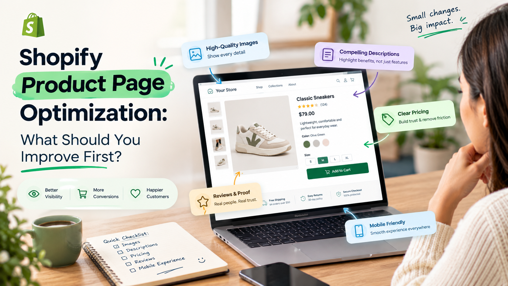
A Shopify product page can have great products, attractive branding, and good traffic—but still struggle to generate sales.
The problem is often not the product itself. It is the product page.
When shoppers land on a product page, they want quick answers. What is this product? Why should I buy it? How much does it cost? Can I trust the store? When will it arrive? What happens if I change my mind?
If those answers are difficult to find, customers may leave before adding the product to their cart.
The good news is that you do not need to redesign your entire Shopify store to improve the experience. Start with the parts of the product page that have the biggest impact on shopping decisions.
In this guide, we’ll look at what to improve first on a Shopify product page, what to prioritize later, and how to create a product page that makes buying easier.
What Is Shopify Product Page Optimization?
Shopify product page optimization is the process of improving your product pages so visitors can better understand the product, feel confident about buying it, and complete their purchase with fewer obstacles.
This can include:
- Product images and videos
- Product titles and descriptions
- Pricing and offers
- Product variants
- Add-to-cart buttons
- Product reviews
- Shipping information
- Return policies
- Trust signals
- Mobile experience
- Page speed
- Related products
- Search engine optimization
But not every improvement deserves your attention at the same time.
If your product images are unclear or your add-to-cart button is difficult to find, changing small SEO elements probably shouldn’t be your first priority.
The key is to optimize in the right order.
What Should You Improve First on Your Shopify Product Page?
Here is a practical order to follow:
- Product information and clarity
- Product images and videos
- Add-to-cart experience
- Price and offer presentation
- Product descriptions
- Reviews and social proof
- Shipping and returns information
- Mobile experience
- Page speed
- SEO and structured data
- Related products and cross-selling
Let’s look at each one.
1. Make the Product Immediately Understandable
The first question a visitor should be able to answer is:
“What exactly am I looking at?”
Your product page should make the product clear within a few seconds.
Start with:
- A clear product title
- Easy-to-understand product images
- Visible pricing
- Available variants
- A short summary of the product
- A noticeable add-to-cart button
Avoid forcing shoppers to read a long paragraph before they understand what the product does.
For example, instead of starting with a long brand story, a product page for a skincare product could quickly communicate:
Vitamin C Face Serum – 30ml
Brightening serum formulated with vitamin C to support a more even-looking complexion.
Then provide the important details below.
A simple test
Look at your product page for five seconds and then ask:
“If I had never seen this product before, would I know what it is and why I might want it?”
If the answer is no, improve the information hierarchy before making cosmetic changes.
2. Improve Your Product Images
Product images often do more selling than paragraphs of copy.
Customers cannot physically touch or examine your product online, so your images need to provide as much useful information as possible.
Use a combination of:
- Main product image
- Multiple product angles
- Close-up images
- Lifestyle images
- Size or scale images
- Product-in-use images
- Packaging images
- Short product videos, where useful
For example, if you’re selling a backpack, don’t only show the front.
Show:
- Inside compartments
- Zippers
- Laptop section
- Side pockets
- Straps
- Material texture
- The bag being worn
This helps customers understand the product before they make a decision.
Don't forget mobile shoppers
Your product images should remain useful when viewed on a smaller screen. Make sure important product details aren’t difficult to see because of excessive whitespace or tiny text.
3. Make the Add-to-Cart Button Easy to Find
Once the customer understands the product, the next step should be obvious.
Your Add to Cart button should stand out from surrounding content without feeling disconnected from the store’s design.
Pay attention to:
- Button visibility
- Button size
- Contrast
- Position
- Variant selection
- Quantity selection
- Sticky add-to-cart functionality on mobile, if appropriate
Avoid making shoppers scroll back to the top of a long page just to add the product.
For products with multiple variants, make the selection process clear.
For example:
Color: Black
Size: Medium
Then clearly show which option is currently selected.
A customer shouldn’t have to guess whether their chosen variant is actually available.
4. Make Price and Offers Easy to Understand
Pricing should never feel hidden or confusing.
Clearly display:
- Current price
- Original price, when there is a genuine discount
- Sale price
- Subscription pricing, if applicable
- Available offers
- Important taxes or additional charges, where relevant
If you offer discounts, don’t make customers hunt for them.
For example:
₹1,499
₹1,999
25% off
is easier to understand than burying the discount inside a paragraph.
However, avoid filling the page with fake urgency, excessive countdown timers, or confusing promotional messages. The goal is to help customers make an informed purchase—not pressure them into one.
5. Rewrite Your Product Description Around Customer Questions
A product description should do more than describe the product.
It should help answer the questions customers have before purchasing.
Instead of focusing only on features, explain the practical value of those features.
Weak approach:
Made with premium cotton fabric and reinforced stitching.
More useful approach:
Made with soft cotton fabric and reinforced stitching for everyday comfort and durability.
The second version connects the feature with a reason the customer may care about it.
A useful product description can cover:
- What the product is
- Who it is for
- Main benefits
- Important features
- Materials
- Dimensions
- How to use it
- What’s included
- Care instructions
You don’t necessarily need a huge block of text.
Use headings, bullet points, and short paragraphs so shoppers can scan the information.
6. Add Reviews and Social Proof
Customers naturally want reassurance before buying from an unfamiliar store.
Reviews can help answer questions that your product description cannot.
Useful review elements include:
- Star ratings
- Written reviews
- Customer photos
- Verified purchase indicators
- Ratings by product attributes
- Frequently mentioned benefits
Don’t hide reviews at the very bottom of a long product page.
A summary such as:
4.8/5 ★ — 126 reviews
near the product information can immediately provide additional reassurance.
If customers frequently ask the same questions in reviews, consider adding the answers directly to your product page.
7. Put Shipping and Return Information Where Customers Can Find It
Shipping and returns can strongly influence a purchase decision.
A customer may like your product but still hesitate because they don’t know:
- When it will arrive
- How much shipping costs
- Whether shipping is free
- Whether the product can be returned
- How long they have to return it
- Who pays return shipping
Don’t make shoppers leave the product page to search through your website for these answers.
Consider adding expandable sections such as:
Shipping Information
Returns & Exchanges
Delivery Estimates
Warranty Information
This keeps the page clean while still making important information accessible.
8. Optimize the Mobile Product Page
A product page that looks great on desktop can still provide a poor mobile shopping experience.
Check your page on an actual smartphone.
Look for problems such as:
- Product images taking too long to load
- Buttons that are difficult to tap
- Tiny text
- Excessive scrolling
- Pop-ups covering product information
- Variant selectors that are difficult to use
- Important information being pushed too far down the page
Your mobile customer should be able to move naturally through:
Product → Information → Variant → Add to Cart
without unnecessary friction.
A mobile-friendly design isn’t simply about making the desktop layout smaller. The content hierarchy and interactions should work well for touch-based shopping.
9. Improve Product Page Speed
A beautiful product page isn’t very useful if it takes too long to load.
Large images, unnecessary apps, tracking scripts, animations, videos, and third-party widgets can all contribute to a slower experience.
Review:
- Image file sizes
- Image formats
- App scripts
- Third-party scripts
- Video loading
- Theme code
- Unused sections and functionality
Don’t remove useful functionality simply to make a page lighter. Instead, identify elements that aren’t contributing enough value to justify their performance cost.
For Shopify stores with significant traffic, even small performance improvements can make the shopping experience smoother.
If a product page contains large images, unnecessary scripts, or app-related code, Shopify speed optimization can help identify and address performance issues without removing features that customers actually need.
10. Optimize the Product Page for Search
Once the customer-facing experience is strong, work on SEO.
Important areas include:
Product title
Use a clear, descriptive product name rather than forcing keywords into it.
Meta title
Create a concise title that communicates the product and matches search intent.
Meta description
Use it to explain what the product offers and encourage relevant searchers to visit.
Product URL
Keep URLs readable and descriptive.
Image alt text
Describe images accurately rather than stuffing keywords into every image.
Product structured data
Use appropriate structured data so search engines can better understand information such as product details, pricing, availability, and reviews when eligible.
SEO should support the shopping experience rather than make product pages sound unnatural.
11. Add Related Products at the Right Point
Once the main product page is working well, you can look at increasing the value of each visit.
Useful recommendations might include:
- Related products
- Frequently bought together items
- Matching products
- Accessories
- Product bundles
- Recently viewed products
For example, if someone is viewing a camera, relevant recommendations might include a memory card, camera bag, or spare battery.
The important part is relevance.
Showing random products simply because they are available can distract customers from the product they’re already considering.
A Simple Shopify Product Page Structure
Your product page structure should also work naturally with your Shopify theme. If your current theme limits the way you present product information, variants, reviews, or conversion elements, a customized Shopify theme can give you more flexibility. A practical product page could follow this structure:
Above the fold
- Product images
- Product title
- Rating
- Price
- Short value proposition
- Variant selection
- Add to Cart
- Buy Now, if relevant
Below the main purchase area
- Product benefits
- Detailed description
- Product specifications
- Shipping information
- Returns information
- Reviews
- FAQs
- Related products
This structure gives customers the important buying information first while still providing detailed information for people who want to research further.
Shopify Product Page Optimization Checklist
Before making changes, go through this checklist:
Product clarity
- Is the product immediately understandable?
- Is the title clear?
- Is the price easy to find?
- Are variants easy to select?
Visuals
- Are product images high quality?
- Are multiple angles shown?
- Are lifestyle or usage images included where useful?
- Is there a product video when it adds value?
Conversion experience
- Is Add to Cart easy to find?
- Are product options clear?
- Is the checkout path straightforward?
- Are trust signals visible?
Product information
- Does the description explain benefits?
- Are specifications easy to scan?
- Are common customer questions answered?
Trust
- Are reviews visible?
- Is shipping information clear?
- Are returns easy to understand?
- Are guarantees or warranties explained where applicable?
Technical
- Does the page load quickly?
- Does it work properly on mobile?
- Are images optimized?
- Are unnecessary scripts or app elements removed?
SEO
- Is the product title descriptive?
- Is the meta title optimized?
- Is the meta description useful?
- Are images using meaningful alt text?
- Is appropriate product structured data implemented?
What Should You Fix First?
If you have limited time or resources, don’t try to change everything at once.
A practical priority order is:
- Product clarity
Make sure visitors understand what you’re selling. - Images
Show the product clearly from different perspectives. - Add-to-cart experience
Make purchasing straightforward. - Price and offers
Make the cost and genuine savings easy to understand. - Product information
Answer the questions customers need answered. - Reviews and trust
Give shoppers reasons to feel confident. - Shipping and returns
Remove uncertainty around the purchase. - Mobile experience
Make sure everything works smoothly on smaller screens. - Performance
Reduce unnecessary loading and improve page speed. - SEO
Help search engines understand and surface the page.
This order isn’t a universal rule for every store. Your analytics may reveal a different problem. For example, if customers frequently reach the product page but abandon after selecting a variant, improving the variant-selection experience may deserve immediate attention.
Improve Your Shopify Product Pages With eWebWorld
A product page should do more than display a product. It should help customers understand what you’re selling, answer their questions, build confidence, and make the next step clear.
If your Shopify store needs better product-page design, functionality, speed, or conversion-focused improvements, eWebWorld can help you identify the areas that need attention and implement practical changes based on your store’s goals.
Explore Shopify development services with eWebWorld and build product pages designed around a better shopping experience.
Final Thoughts
Shopify product page optimization isn’t about adding more content, more pop-ups, or more design elements.
It is about removing uncertainty and making the buying process easier.
Start by asking what a customer needs to know before clicking Add to Cart. Make that information clear, visible, trustworthy, and easy to understand.
Then use your Shopify analytics, customer feedback, reviews, and conversion data to identify the next problem worth fixing.
A better product page doesn’t have to be complicated. It simply needs to help the right customer move from “Is this what I need?” to “I’m ready to buy.”
People Also Ask
1. What should I improve first on my Shopify product page?
Start with product clarity, images, pricing, variants, product descriptions, and the Add to Cart experience. Then focus on reviews, shipping information, mobile usability, page speed, and SEO.
2. How can I optimize my Shopify product page for more conversions?
Make the product easy to understand, use high-quality images, display pricing clearly, make the Add to Cart button prominent, include customer reviews, answer common questions, and provide clear shipping and return information.
3. What makes a good Shopify product description?
A good product description explains the product’s main benefits, features, specifications, materials, usage, and other information customers need before buying. Keep it easy to scan with short paragraphs and bullet points.
4. How important are product images on a Shopify product page?
Product images are extremely important because customers cannot physically examine the product online. Use multiple angles, close-ups, lifestyle images, and videos where they help customers understand the product better.
5. How can I improve my Shopify product page on mobile?
Make sure product images load properly, text is readable, buttons are easy to tap, variant selection is simple, and important product and purchasing information is easy to access without excessive scrolling.
6. Can eWebWorld help optimize Shopify product pages?
Yes. eWebWorld can help Shopify stores improve product-page design, functionality, performance, usability, and conversion-focused elements to create a smoother shopping experience.

About The Author
Akshita Dubey is an SEO Executive at eWebWorld with expertise in search intent analysis and content optimization. She focuses on creating user-centric content that simplifies complex technology topics, helping businesses and decision-makers understand web development, mobile apps, and digital solutions through clear, research-based insights.
Search
Popular Posts

Follow us

Recent Posts
About eWebWorld
eWebWorld is a Shopify and eCommerce development company in India with 10+ years of experience building and scaling online stores. We specialize in Shopify development, including store setup, customizations, theme development, migrations, integrations, and performance optimization. Through our expertise in eCommerce, technology, and digital marketing, we help businesses create better online experiences and achieve sustainable growth.